After a couple of months hung up at the back of the wardrobe, Football Kit Roundup returns to take you through the best and worst of the new Euro 2016 kits and a special look at the new Scotland get-up.
Yes, that new Scotland kit which will be the eye-feasting spectacle when Scotland take to the field for their inevitably disappointing bid to qualify for World Cup 2018. The home and away tops have been released and it’s safe to say that they’re fairly controversial.
You’ve seen them and you’ve formed an opinion by now. Scotland’s new set of tops have caused more of a stir than… err… the last away shirt. For me, there’s something about both of them which doesn’t quite hit the mark.
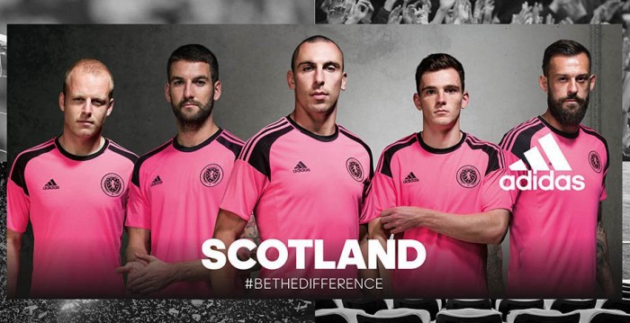
If you’re not a fan of the away shirt because it’s pink and “pink is a lassie’s colour” then you need to either get yourself a grip that could tear the entire world in half from pole to pole or just buy yourself a fedora. Its problem is simple – it’s not pink enough. Scotland are known for that salmon pink that we’ve sported quite a few times and this one’s just a mite too fluorescent. If they’re trying to invoke those early & late 90s away shirts but wanted to avoid salmon altogether, they should have gone with something similar to the deeper pink from the last away kit.
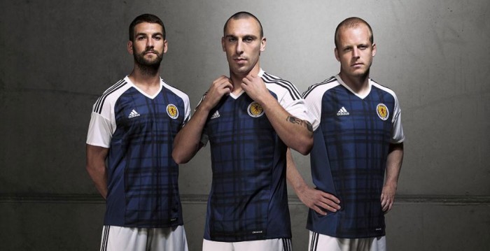
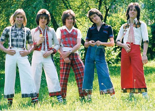
The home kit? It’s nice but it doesn’t look balanced thanks to the white shoulders. If it wasn’t for them it would be fantastic but as it stands? It’s a bit Bay City Rollers.
Still… I could be wrong so I asked Twitter what it thinks of the new Scotland clobber. There was some disparity in the results, proving that there’s no accounting for taste.
@Steakheed @ScotComFC nah they're both fire. I'll get the home kit. If they make a zipper version of that it'll fly off the shelf
— Seanie Biegel (@simonkowski) November 23, 2015
@ScotComFC it looks like they were designed by an English man with myopia. ?
— Peter Burrell (@BurrellPeter) November 23, 2015
@ScotComFC Appalling – the SFA are really taking the piss now
— Cosmichaggis (@Cosmichaggis) November 23, 2015
@ScotComFC fuckin smert for me like
— Craig Crosbie (@Cragsville) November 23, 2015
@ScotComFC pic.twitter.com/1ArigAJZSl
— OnlyAnExcuse (@OnlyAnExcuse) November 23, 2015
@ScotComFC the home top is a belter. The away looks like a training kit.
— Russell Abercrombie (@russabercrombie) November 23, 2015
@russabercrombie @ScotComFC the away top looks like an away top, classic yuck, love it, problem is home top looks like a weak away top!
— Si Dick (@SiDick77) November 23, 2015
There you have it – Twitter has spoken. Of course, since many Scots will be desperately seeking a team to support at the Euros, why not do what sensible people do and choose your team by which kit you like best? Here are five of the best and worst from what’s been released so far.
5. Germany Away
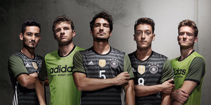
Sure this top may be reversible for what I assume to be absolutely no purpose at all (I find it hard to imagine the German squad warming up in them, going into the dressing room and turning them round) but its main side is damn good looking. After a few dodgy attempts at away shirts over the last decade, Germany have hit the jackpot with this and its predecessor from World Cup 2014.
4. Russia Away
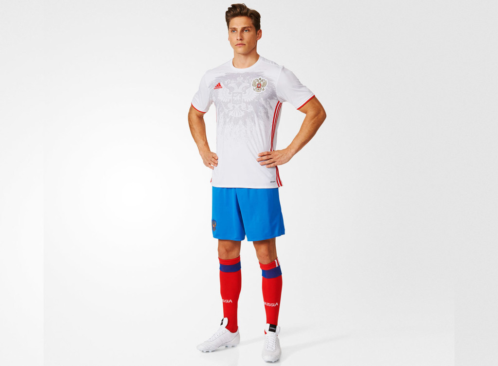
It looks like the Russian flag. It doesn’t look any good but at least it does look like the flag.
3. Spain Away
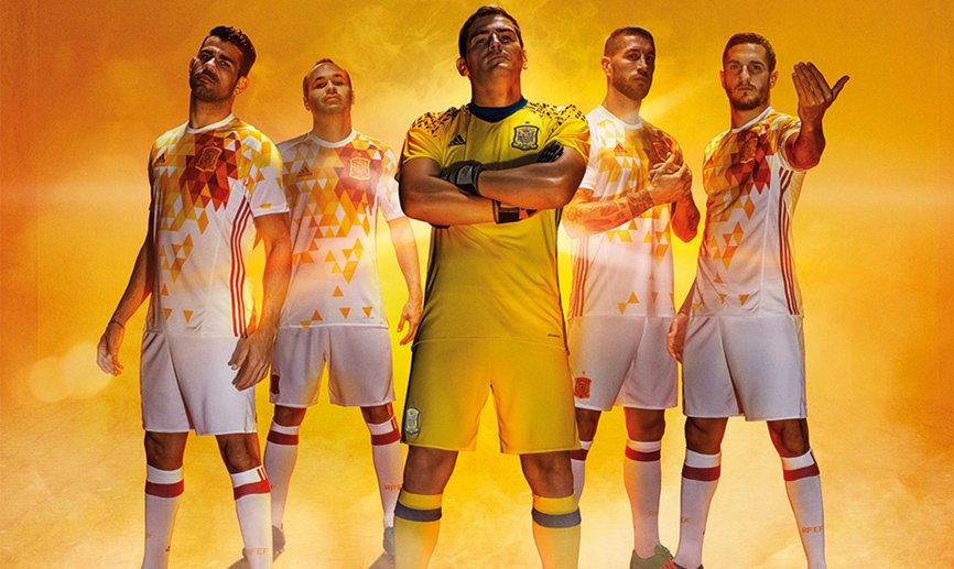
This Spain shirt is going to be one of those Marmite tops and while I hate Marmite with the burning passion of a thousand suns, I love this shirt. The white collar just makes it.
2. Wales Home
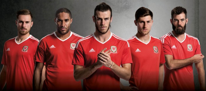
Simple, effective, flatters to deceive and relies on one player to make it look good, this fantastic shirt is a lot like the Wales squad.
1. Belgium Home
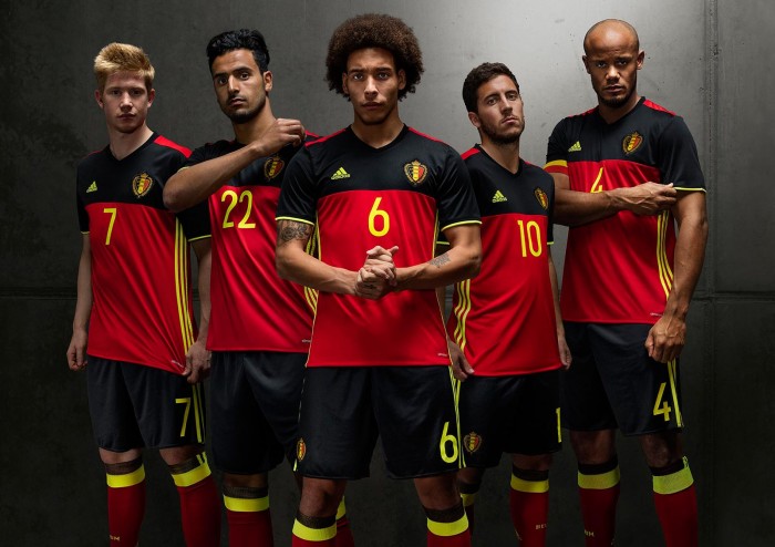
A shirt which manages to make even baby-faced Kevin De Bruyne look menacing, this shirt from Adidas is one of the nicest to be released so far. Apart from their away top which is actually even cooler.
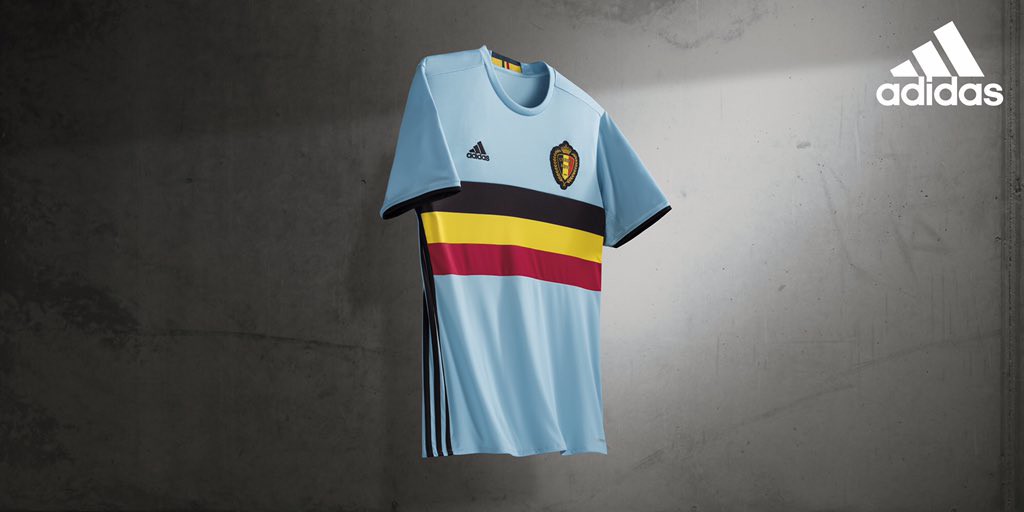
Bloody Belgium.

He is the editor of this fine site and a regular on the Scottish Comedy FC Podcast despite refusing to go anywhere near Owen's house.
He supports Kilmarnock and is a comedian to no-one but himself.
